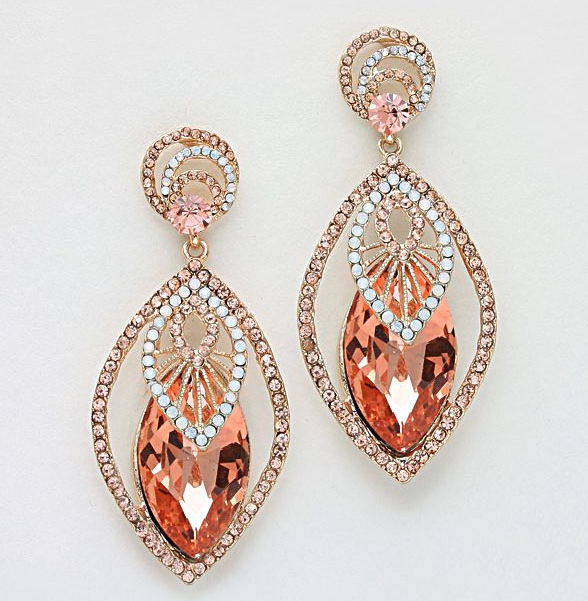
Today's Wednesday Workshop features a pair of Emma Stine earrings found via Pinterest. This piece shows us a useful lesson about balancing repetition and variation in design.

Note how the earrings are made of identical shapes in three different colors: deep rose, pale rose, and white. The designer has put the highest contrast in the center by putting the bright white-and-metal marquise on top of the deep rose crystal marquise, making the center of the earring the focal point -- a strong design choice. The pale rose marquise frames the contrast and completes the color and shape story (we love the Rule of Three even in visual design). The round post mounts at the top echo the pattern (three colors, brightest in the middle with a pale rose frame) but don't compete with the power of the marquise shape.
Try this on:
- Peyote hexagons and round rings, much as I love building them, aren't going to work as well for this shape story: they leave too much space on either side, which will unbalance the design. Rectangles and ovals, though, could be used in similar ways. For instance, a quick pendant design sketch:

- Another idea would be to vary the order of the shapes -- put the bright white marquise in the center as a focal, flanked by several marquises of deep rose, and then straps of pale rose marquises to either side for a necklace or bracelet.


